Summary
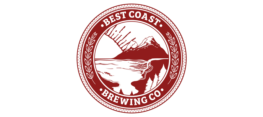
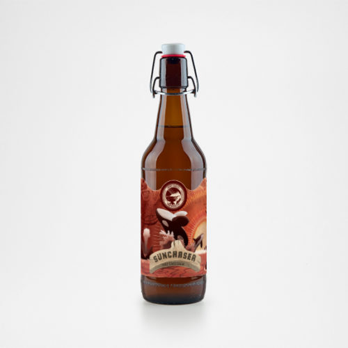
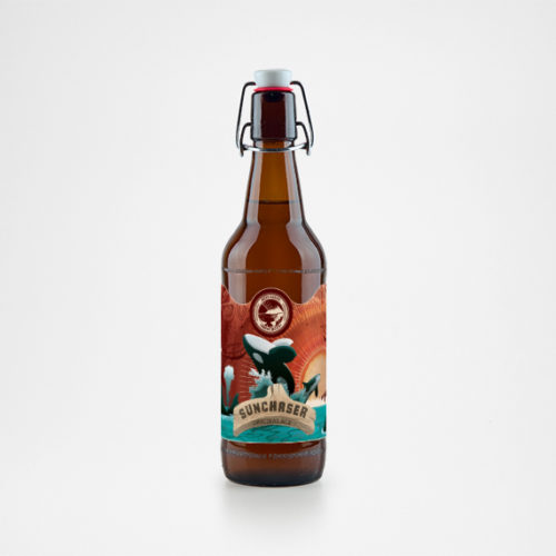
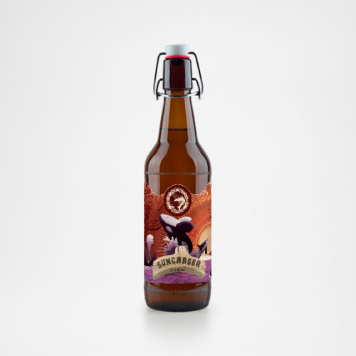
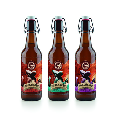
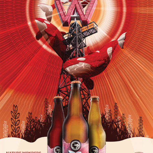
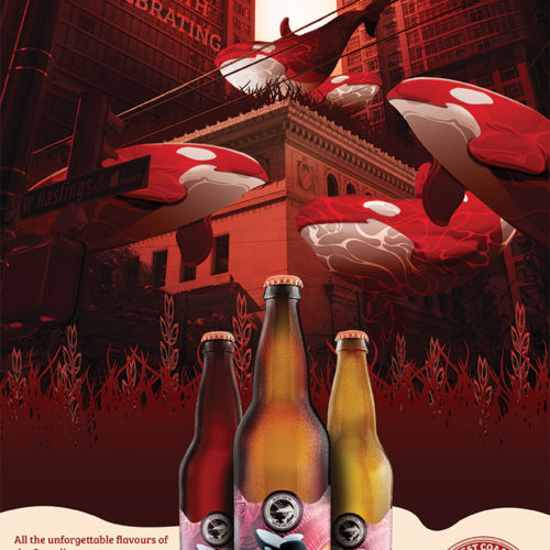
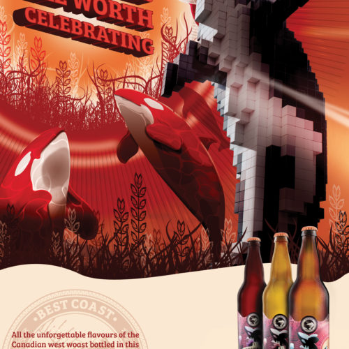
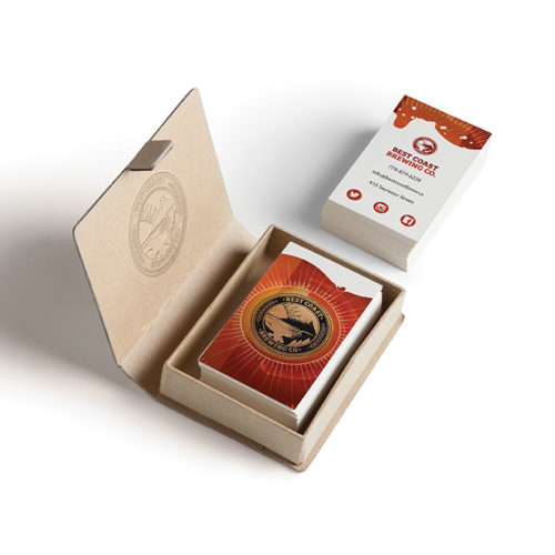
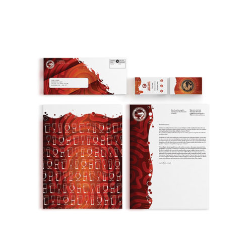
Best Coast Brewery is a Vancouver based craft brewing startup that specialized in seasonal or celebration themed brewing projects. The goal of this project was to develop brand identity from the ground up that includes everything from seasonal label packaging to it’s advertising campaign. Best Coast Brewery prides itself on its Canadian West Coast Roots and celebrates it by adorning imagery so commonly associated with this area of the country, especially with its ode to the Wildlife mot notably the Orca or Killer Whale. Such imagery would appeal to our key market of educated men and women ages 20 – 30 who empathize or participate in efforts of conservation globally and at home.
The Biggest concern with appealing to this demographic was in the visual aesthetic of Best Coast Brewery’s fresh identity. The dramatic presentation of the Orca in both the labeling and advertising is indicative of the sheer wonder that comes with being in the presence of such a creature. The colour palette is rustic in nature filled with a broad range of earthy and rustic red, oranges and yellows that represent colours commonly associated with wheat and hop harvesting beyond it’s ode to nature in general. Above all this palette with how warm it is gives off the feeling of joy and celebration. The above mentioned combined with noticeable imagery common of Vancouver serves as a reminder in the sense of pride Vancouver’s local population has when it comes to finding balance between our world and nature around us. Several fonts were used in the design process featuring a heavy amount of hand script like serif fonts such as Adobe Caslon Pro and Bree serif the latter giving a nod to vintage design while the latter though serif based features a more fun and youthful feeling ideal for catching the viewers attention.
